
Most B2B marketing funnels lose the majority of their visitors at the form. Industry benchmarks put the average form conversion rate around 2 to 3 percent, with top performers above 10. Closing that gap is not a copy problem. It is structural. Fewer fields, smarter pacing, and a real follow-up. This guide is the playbook, plus eleven involve.me templates you can fork in a click.
Key Takeaways
Cutting one non-essential field can lift conversion by 30 to 50 percent. Most B2B forms have at least one you could cut today.
Multi-step forms convert roughly 30 percent higher than classic single-step forms on the same traffic.
Leads contacted within 5 minutes are roughly 100x more likely to qualify than leads contacted after 30. The form does not stand alone.
Five anatomy components matter: value proposition, fields, CTA, trust signals, and confirmation. Skip any one and the funnel leaks.
Eleven ready-to-use templates in the gallery below, organized by use case. Pick one and ship today.
What a Lead Capture Form is
A lead capture form is a short web form that trades a piece of value (a gated download, a demo, a quote, a newsletter, a giveaway entry) for a visitor's contact details. It is the moment in the funnel where an anonymous visitor becomes a known lead and starts moving through the rest of your stack: CRM, scoring, nurture, sales handoff.
The mechanics are simple. The execution is where most marketers leak the funnel. The same form that captures 2 percent on one site captures 11 percent on another with the same traffic. The difference lives in five components.
The Five Components of a High-converting Form
Every form that wins is built on the same skeleton. Skip a part and conversion drops in a predictable way.
Value proposition. The reason someone fills out the form. If the headline above the form does not make the trade feel worth it, nothing else matters. "Get the 2026 B2B benchmark report" beats "Sign up for our newsletter" every time, because the trade is concrete.
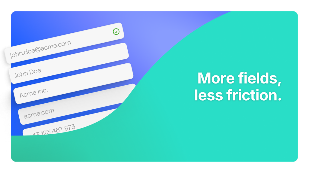
Fields. The data you collect. Every non-essential field is a tax on conversion. Form-usability studies have repeatedly found that cutting one field can lift conversion by 30 to 50 percent. Three fields is the working floor for B2B; five is the ceiling for a first touch.
Call-to-action. The button. "Get the guide" works. "Submit" does not. Action-led CTAs that name the value outperform generic ones consistently in published A/B test results.
Trust signals. A privacy line under the email, a GDPR consent checkbox, and a one-sentence note on what you will do with the address. Baymard's 50 Cart Abandonment Rate Statistics puts privacy and security concerns among the top reasons users walk away.
Confirmation and follow-up. The thank-you screen, the day-zero email, and the speed of sales response. James Oldroyd's Lead Response Management Study, published in Harvard Business Review, found that leads contacted within 5 minutes of submission are roughly 100x more likely to qualify than leads contacted after 30. The form starts the conversation; the follow-up is where it gets won or lost.
Eight Evidence-backed Best Practices for 2026
Distilled from the published usability and conversion research, applied to the patterns that work in B2B funnels. Each one is something you can implement today.
Eliminate every non-essential field. Walk through your current form and ask, for each field, what decision changes if this answer is missing. If nothing changes, cut it. The 30 to 50 percent lift from cutting a single field is well-documented, not aspirational.
Use a single-column layout. Users complete single-column forms faster than multi-column layouts because the eye-scan is linear rather than zig-zag. Nielsen Norman Group's form design research documents this as one of the foundational rules. Reserve multi-column only for tightly related fields like city/state/zip.
Move to multi-step the moment you have more than five fields. A long single-page form looks like work. A multi-step form looks like a conversation. The commitment fallacy does the rest: once a visitor answers question one, they are far more likely to finish question five.
Make the CTA button mobile-thumb-sized. Over 70 percent of B2B form submissions now come from mobile devices. Buttons under 44 pixels tall lose taps. Larger CTAs lift mobile conversion by a meaningful margin in published mobile UX research.
Replace dropdowns with radio buttons for 2 to 4 options. Dropdowns hide the choices behind a click. Radios show them. For short option sets, radios beat dropdowns on completion across published A/B tests.
Put labels above the field, not inside it. Placeholder-as-label disappears the moment the user starts typing, which is exactly when they need it most. Top-aligned labels are the standard for a reason.
Put trust signals next to the CTA, not at the bottom of the page. A privacy line under the submit button, a GDPR checkbox, and "We will never share your email" are worth more here than in a footer nobody scrolls to.
Speed to lead is the most underweighted lever. Set the day-zero email to fire on submit, route the lead to a real human within minutes, and the rest of your funnel works harder. The Oldroyd HBR study is unambiguous on this: a perfect form with a 24-hour follow-up loses to a decent form with a 4-minute follow-up.
Classic Vs Multi-step: the involve.me Sweet Spot
The single biggest structural decision in lead capture is whether the form lives on one page or many. The evidence is one-sided. Industry benchmarks put multi-step and conversational forms at roughly 30 percent higher conversion than classic single-page forms on the same traffic, with in-app survey completion rates climbing into the 80s on conversational designs against the low 20s on classic.
The reason is psychological, not technical. A classic form shows the user the full ask up front. A multi-step form starts with a low-effort question (a checkbox, a one-click choice) and only asks for the email after the user has invested two or three answers. By the time the email field appears, the visitor has stopped browsing and started committing.
This is where involve.me leans hardest. The funnel builder is multi-step by default, with conditional logic that lets you branch the form based on earlier answers and a calculation engine that lets you score, route, or quote in real time. A demo request can ask "what's your team size" on screen one and route a 500-person company to a calendar link while routing a 5-person team to a self-serve trial page, all without leaving the form. That is the conversion-funnel layer; static form builders cannot reach it.
Skip the blank canvas. The involve.me template library has hundreds of forms, calculators, and funnels you can fork and brand. Eleven of the best lead capture templates are listed below.
11 Lead Capture Form Templates to Start from
These templates are organized by the use case they were built for. Each one is a working multi-step form you can fork into your own brand in minutes, then wire into your CRM. Click any title to open the template.
Gated Content (whitepaper, Ebook, B2B Lead Magnet)
Use these when your offer is a downloadable asset. The pattern that wins here is short: email and name on the gate screen, deliver the asset on the thank-you page (not via a "check your inbox" message that costs you 20 percent of the downloads).
Whitepaper Download. The canonical B2B asset gate. Use it for analyst reports, research findings, or any deliverable a buyer would expense. Keep the form to three fields. Set a custom field with the asset name so HubSpot or Salesforce can route by topic.
Download E-Book. The ebook variant of the same pattern, with cover-image placement above the form. Pair with a UTM-tagged campaign and you get attribution per channel.
B2B Lead Magnet. A more qualified gate, with optional fields for company size and use case. Use this when the asset is high-cost-to-create (a benchmark report, an industry survey) and you want sales to see segmentation data on insert.
Demo and Consultation Requests
For higher-intent traffic. The pattern shifts: more qualifying questions, less aggressive on email speed, more aggressive on routing to the right human.
Demo Booking Form for Software. A SaaS-specific qualifier with team size, current stack, and use case fields. Routes to a calendar booking screen when the lead qualifies, to a self-serve trial when it doesn't.
Get Free Consultation. A service-business variant of the demo pattern. Single-step with a tight three-field setup for top-of-funnel consultation offers.
Consultation Scheduling Form. Combines the intake form with calendar scheduling in one flow, so the lead leaves with a booked time rather than a confirmation email.
Direct Lead Generation
For pages built specifically to capture leads with no other purpose. Higher field counts are acceptable here because intent is higher; the visitor came looking for a conversation.
Sales Lead Form. The direct contact-with-sales pattern. Five fields, branching logic for budget and timeline, routing to the right rep on submit.
Marketing Lead Generation Form. The marketer's version: optimized for list growth and segmentation. Includes a topic-of-interest dropdown that becomes a tag in your ESP on submit.
Agency Lead Generation Form. Built for agencies pitching new clients. Includes service-line questions and budget bands so the agency can disqualify before the discovery call.
Newsletter and Event Registration
The list-growth pattern. Lower commitment, higher volume. Keep these short and conversion-focused.
Newsletter Signup Form for Software. Two-field email capture with a clear value proposition for SaaS newsletters. The benchmark to beat: a 5 to 8 percent conversion rate from a relevant landing page.
Webinar Registration Form for Agencies. Event registration with a qualifier built in. Captures email, name, and one segmentation question so post-webinar follow-up can be personalized to the audience the registrant identified with.
How to Build a Lead Capture Form in involve.me
The steps below assume you have an involve.me account. The free plan covers everything in this guide.
Start from a template, not a blank page. Pick one from the gallery above that matches your use case. Forking a template gives you the multi-step skeleton and the logic wiring already done.
Rewrite the value proposition. The first screen is your headline plus a one-line subhead. Replace the placeholder copy with your actual offer ("Get the 2026 B2B benchmark report", not "Subscribe to our newsletter").
Cut the fields down to three to five. Open the page list in the visual flow editor. For every field, ask the cut-or-keep question. Be ruthless. The default form will probably feel too short. That is the point.
Add conditional logic where it earns its keep. If your form has a "team size" or "use case" field, use logic jumps to skip irrelevant follow-up questions for each branch. The form should feel personalized to the answer, not like a generic survey.
Design the thank-you / outcome page. Pull the calculated value or the asset link onto the result screen. If you promised a download, deliver it here, not in an email. If you promised a calendar slot, show the embedded calendar.
Connect your CRM and email tool. Open Integrations. Pick HubSpot, Salesforce, Mailchimp, ActiveCampaign, Klaviyo, or Brevo (all native). Map form fields to CRM properties. Set the lifecycle stage and any tags on insert. Configure a webhook if you need a custom downstream system.
Embed the form where the traffic is. involve.me offers inline, popup, slide-in, full-page, and shareable URL embeds. Inline on a hyper-targeted landing page is the standard for warm intent. Popups work better for content pages where the form is secondary.
Set up the A/B test before you launch. Fork the funnel once. Change one thing (the CTA copy, the field count, the order of questions). Run both variants against half the traffic each. Pick the winner after a statistically meaningful sample, not on day three.
Common Mistakes to Avoid
These show up in roughly nine out of ten B2B lead capture forms we audit. None of them require a redesign to fix. All of them require a decision.
Asking for the phone number too early. A phone field on a first-touch form is a conversion killer. Required phone fields show up in form-abandonment research as one of the largest single drivers of drop-off. If sales truly needs it, make it optional.
Using "Submit" as the CTA. "Submit" is what the browser does, not what the user wants. Replace with the value: "Send me the report", "Book my demo", "Start my free trial".
Hiding the form below the fold. If visitors have to scroll to find the form, you have lost half of them. Lead with the form on a lead capture landing page; do not bury it under three paragraphs of pre-amble.
Skipping the mobile test. Over 70 percent of submissions are mobile. If you have not opened your own form on a phone in the last week, do that now.
No next step on the thank-you page. "Thanks, we will be in touch" is the lowest-value confirmation screen possible. Use it to offer a calendar link, recommend the next asset, or pre-segment the user for the nurture track.
Treating the form as fire-and-forget. The form is the start of the relationship. If you do not have a day-zero email, a 48-hour follow-up, and a sales SLA on response time, the form is doing only half its job.
Measure What Matters
Four metrics give you almost everything you need to optimize a lead capture form. Track them in that order; optimize one at a time.
Completion rate. Visitors who finish the form, divided by visitors who started it. Below 50 percent means the form is too long or the first question is wrong. Above 80 percent on warm traffic is healthy.
Field-level drop-off. Which specific field is bleeding completions. involve.me's analytics shows this per question. The biggest single optimization wins live here.
Submission-to-MQL rate. How many submitted leads pass your qualification bar. Low rate means the form is letting through bad-fit leads; tighten the qualifier questions or add scoring.
Speed to first response. Median time between submission and a real human reaching out. The 5-minute window is not aspirational; it is the threshold the Oldroyd study identifies for the 100x qualification multiplier.
For A/B testing, fork the funnel once and change one variable at a time. The highest-leverage variables in our experience are, in order: number of fields, CTA copy, form type (classic vs multi-step), and the first question. Test the field count first.
Build It Once, Ship It Everywhere
The lead capture form is the single highest-leverage piece of conversion infrastructure in most B2B marketing stacks. Get the five components right, default to multi-step, cut the fields you cannot defend, and wire the form into a real follow-up flow. The 11 templates above cover most of the use cases a B2B marketer will hit in a year. Pick one, fork it, ship it this week, and start collecting the data that will tell you what to tune next.
Build your lead capture form on involve.me.
Free plan, no credit card. Fork a template, wire it into your CRM, and have a working form on your site in under an hour.
FAQs
-
Three to five fields for a first-touch lead capture. Email and name cover most use cases. Add a company field for B2B, a job title field for routing, and a use-case dropdown if you intend to qualify. Every extra field past that point is a tax on completion. Form-usability research has repeatedly found that cutting a single non-essential field can lift conversion by 30 to 50 percent, so add fields deliberately, not by reflex.
-
After the qualifying questions, before the result or thank-you page. Asking for the email on the first screen kills completion because the visitor hasn't invested anything yet. Asking for it after the value is delivered kills capture because they no longer need to. The screen between the qualifiers and the outcome is where well-built lead capture forms land.
-
Industry benchmarks put the average form conversion rate around 2 to 3 percent across industries, with top performers above 10 percent. For warm intent traffic on a focused landing page, 6 to 10 percent is achievable when the form is multi-step, mobile-optimized, and follows the practices in this guide. Cold paid traffic typically runs lower, in the 2 to 4 percent range.
-
Through a native integration that maps form fields to CRM properties and fires a webhook on submission. involve.me ships native integrations with HubSpot, Salesforce, Mailchimp, ActiveCampaign, Klaviyo, Brevo, Pipedrive, and Zoho CRM. Each captured lead becomes a contact or lead record in real time, with custom fields preserved and lifecycle stage set on insert.