What is it that makes a landing page effective? Your goal when a visitor lands on your site is to grab their attention and keep them reading. Once you've presented evidence that your service or product is the best choice and solves their problem, help them complete the buyer's journey by offering a strong call-to-action (CTA). In theory, it sounds simple, but all web designers know many minor factors come into play.
Conversion rates vary, depending upon the industry. Even sectors with higher conversion rates only hit about 2.4% on average. Before deciding how high your conversion rate should be, know the averages for your sector and seek to break past those barriers.
While you can't control how buyers behave, you can make some changes to your pages to optimize conversions. Here are eight landing page tweaks to get you started.
1. Identify Flaws
Before you change anything on your landing page, spend time digging into your analytics and see what needs adjusting. You'll waste a lot of time trying different things only to find they don't work. You must first diagnose the problems and then seek solutions, such as restructuring your page or tweaking your CTA button. A research-based approach has the highest chance of increasing conversions.
Get Started with Converting Lead Pages
With One Of Our 300+ Templates

2. Choose Relevant Photos
In the early days of your business, it's easy to go with generic stock photos. The problem, however, is when a site looks like hundreds of others. When you use unique visuals, you tell a story both with the text and the pictures. The right graphics can direct users to the action you want them to take.
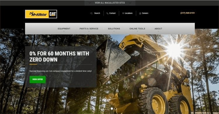
MacAllister Machinery uses gorgeous photos of their equipment to prove their unparalleled service and reputation in the industry. The focus is on the product they offer new, used and for rent. Note their CTA, which points to more information on their product. Anyone landing on this page has no doubt the site is about heavy equipment.
3. Refine Your Unique Value Proposition
What unique value (UVP) does your company offer that no one else in the industry does? Present your UVP early in the text. Let users know the benefits of doing business with you. Some unique ways of showing what you offer include customer testimonials, bullet points listing advantages and tables comparing your services with competitors. People are more likely to take action if they understand the pros and cons.
4. Write Attention-Grabbing Headlines
Your landing page headlines have a massive impact on bounce rates. The visitor lands on your page and sees whether your solution fits their pain point. A headline makes them read on or click away. Conduct A/B testing on two different choices for your headers by showing two versions of your headline. You'll see which performs best. As you tweak your site, you may want to add more refinements and test those against old versions.
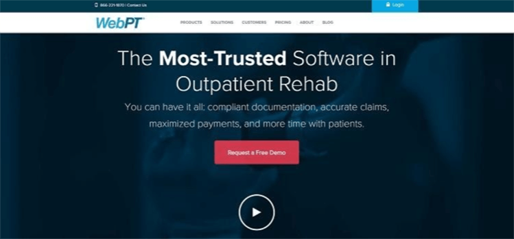
WebPT utilizes a bold headline to explain what they do. It reads, "The Most-Trusted Software in Outpatient Rehab." The subheading goes on to explain the different features most relevant to their target audience, such as compliance, maximized payments and time management. From the second an individual lands on their page, they know if the information applies to them.
5. Speed Up Loading Times
People want your page to load the second they land on it. They won't wait around for longer than a few seconds, especially on mobile devices. Keep images compressed and use tools such as caching to speed up your site. Avoid heavy scripts or coding. Invest in a fast server. You can use tools such as Google Insights and Pingdom to test your page speeds and gather tips for improving.
6. Use Action Words for CTAs
For your calls-to-action to be effective, they must repeat the solution you've already detailed. Use action words driving the user to do something. Of course, you also should work on the placement, size, shape and color of your buttons. Test everything with split or multivariate testing and see which versions your users respond to best. Even a 1% increase in conversions makes a significant difference in your revenue.
Action words tell the user what the next step is. Try out phrases like:
Get My Free Book
Request a Custom Quote
Sign Up for Coupons and News
Use a verb combined with the offer to drive conversions.
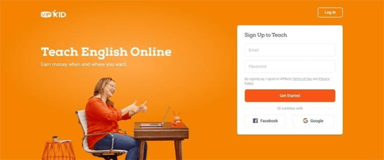
VIPKid offers a landing page for teachers wanting to work with children online. Their specialty is English as a second language. Notice the action words for the CTA. The button reads, "Get Started." The wording at the header for the form indicates you're signing up to teach. Everything moves the teacher toward starting their journey.
7. Cut Form Fields
Collect only the information you must have to reach out to the lead. People are busy and don't have time to fill in endless form fields, especially if they are on a mobile device where inputting data is trickier. Cut your input areas down to only the information you must have, such as a name and email.
Think about how you reach out to your contacts most frequently and require only vital info. Leave out other spaces or make them optional. You should also seek out autofill options, such as letting them sign up with information from a Facebook or Google account.
Best Way to Improve Landing Page Conversions
There are many different things you can try to improve your landing page conversion optimization. As you perfect each section of your page, test it thoroughly to see how users respond. You can always revert to the last update or try something different. Keep working on different sections until your percentages hit your goals for the page.
Author
Lexie is a web designer and digital nomad. She enjoys kayaking with her goldendoodle and baking new cookie recipes. Check out her design blog, Design Roast.