
An events landing page is the digital centerpiece of your event marketing strategy. Whether you’re promoting a conference, webinar, workshop, or virtual networking session, this page is designed with one purpose in mind: to drive conversions. Unlike generic event pages on a website, an optimized event landing page is focused, measurable, and highly effective at turning interest into registrations, RSVPs, or ticket sales.
This guide covers everything you need to know:
What is an events landing page?
What makes a great event registration landing page?
How to structure it
Common mistakes to avoid, and how to build one using a landing page builder
What is an Events Landing Page?
An events landing page is a webpage designed with one mission: to drive conversions for a specific event. It is not like a standard events section on a website which might list multiple upcoming activities, contain navigation menus, or include company related information, this page removes all unnecessary distractions.
Every element, from the headline to the event registration form and call-to-action (CTA), is crafted to guide the visitor toward a single outcome: register, RSVP, purchase a ticket, or join a waitlist.
The strength of an events landing page lies in its clarity and focus. Visitors don’t have to hunt for key details like the date, time, or registration button. Instead, those essentials are immediately visible above the fold, creating a frictionless path to sign-up.

Key Characteristics of an Events Landing Page
Single Goal: Focused around one clear CTA such as “Save My Seat” or “Register Now.”
Tailored Messaging: Matches the tone, promise, and intent of the campaign that brought the visitor there.
Distraction-Free: No unrelated links or competing offers, just the event and its value.
Conversion-Centric Design: Optimized forms, compelling visuals, and urgency triggers like countdown timers or limited capacity notices.
Common Use Cases
Webinars and Virtual Events – Drive registrations for online sessions and ensure smooth RSVPs.
Online Conferences – Present event agendas, speaker lineups, and ticketing options in one dedicated space.
Product Launches or Demos – Create anticipation and collect sign-ups for exclusive previews.
In-Person Workshops or Meetups – Streamline attendee management and highlight location details.
When Should You Use a Dedicated Event Landing Page?
Not every event requires a full microsite, but any event that relies on registrations, ticket sales, or measurable engagement should have its own event registration landing page. Here’s when it becomes essential:
1. Running Paid Campaigns
If you’re investing in paid ads on Google, LinkedIn, or Meta, you need a page that matches the promise of your ad. Sending traffic to a generic homepage dilutes message match and wastes budget. A tailored landing page maximizes ROI by presenting exactly what the ad promised.
2. Sending Email Blasts or Social Campaigns
When you direct email subscribers or social followers to register, the last thing you want is distractions. A landing page ensures every click leads directly to registration, not to your blog, careers page, or unrelated content.
3. Needing Granular Testing and Personalization
Dedicated event pages make A/B testing simple. You can test different CTAs (“Join Free” vs. “Reserve Your Spot”), headlines, or even form lengths. With tools like involve.me, you can also personalize the page journey based on source, role, or responses to previous forms.
4. Hosting Recurring or Evergreen Events
If you run monthly webinars, quarterly training sessions, or evergreen demos, a dedicated landing page acts as a hub. You can keep it live year-round, update details as needed, and reuse templates for consistency.
A dedicated event landing page almost always outperforms a generic event listing or homepage redirect. If your goal is to boost sign-ups, track performance, and optimize for conversion, a standalone landing page is the smartest choice.

What to Do Before Building Your Event Landing Page
Great design starts with great planning. Before you touch a landing page builder, you should:
Define your objective
Is your event about lead generation, paid ticket sales, brand awareness, or community-building? Clarity shapes your design.Know your audience
Use pre-event surveys, quizzes, or registration forms to gather insights. With tools like involve.me, you can add conditional logic to understand your registrants better.Map the funnel
From ad → landing page → confirmation page → follow-up emails, ensure the flow is seamless and measurable.Build a creative brief
Align event goals with attendee expectations. For example, if attendees want expert learning, emphasize the agenda and speakers.Research competitors
Study event landing page examples from past events, noting design patterns, agendas, and CTAs that perform well.
Event Landing Page Best Practices (Optimization Tips)
Building the best event landing page requires more than just listing the date and a sign-up button. Every element should work together to grab attention, build trust, and make it effortless for visitors to commit. Here are proven optimization tips:

1. One Goal, One CTA
The most effective landing pages have a single purpose. Don’t confuse your audience with multiple CTAs like “Register,” “Read More,” and “Subscribe.” Each extra option dilutes your conversion rate.
Instead, pick one clear call-to-action (CTA) such as:
Register Now
Save My Seat
Join the Webinar
Reserve Your Spot
Reinforce it throughout the page so users always know the next step.
2. Above-the-Fold Essentials
Your hero section sets the tone. Visitors should immediately understand:
What the event is (headline)
When it happens (date and time)
How to join (CTA button or event registration form)
For example, instead of a vague headline like “Don’t Miss Our Conference”, use something specific:
“2025 SaaS Growth Summit – Sept 12, Online – Register Free Today.”
This clarity instantly communicates value and urgency.
3. Clear Event Agenda
Attendees want to know what they’ll get out of it. A well-structured agenda answers that question.
Use a collapsible or tabbed design to keep the layout clean.
Highlight keynote speakers, panel sessions, and networking breaks.
Emphasize benefits, not just logistics. Example: “Hands-on growth workshop: Build your 90-day sales funnel.”
This helps prospects visualize the value of attending.
4. Speaker and Sponsor Sections
People register for people, not just content. Adding recognizable names or brands boosts credibility.
Show speaker headshots, job titles, and company logos.
If sponsors are well-known, place their logos prominently.
Include brief bios or key achievements (e.g., “Former Head of Growth at HubSpot”).
This creates trust and increases perceived authority.
5. Social Sharing Options
Turn your attendees into promoters. Simple social sharing buttons for LinkedIn, X (Twitter), and email can expand your reach organically.
Add “Share this Event” CTAs after the registration form.
Pre-fill share text with catchy lines like:
“I just registered for the Future of AI Marketing Summit, Join me here [link].”
This makes it easy for registrants to amplify your event with one click.
6. Create Urgency & FOMO
Nothing motivates sign-ups like the fear of missing out. Use scarcity and time-sensitive cues:
Countdown timers to show how soon registration closes.
Early-bird pricing or discounts for the first X registrants.
Limited seats messaging (e.g., “Only 25 spots left!”).
These psychological triggers push hesitant visitors to act now instead of later.
7. Mobile-First Design
More than half of event sign-ups happen on smartphones. If your page isn’t mobile-friendly, you’re losing attendees.
Use a responsive event page design that adapts to any screen.
Keep forms short and thumb-friendly.
Ensure CTA buttons are large, clickable, and not buried under clutter.
Optimize load speed with compressed images, slowness kills conversions.
8. Repeat CTAs
Don’t assume visitors will scroll back up once convinced. After each major section agenda, speakers, testimonials, add another CTA button or event registration form.
For example:
After agenda → “Sounds valuable? Reserve your spot now.”
After speakers → “Want to learn from these experts? Register today.”
This removes friction and captures sign-ups at peak interest moments.
Optimizing Your Event CTA and Registration Form
Your CTA and event registration form are the heart of conversions. Optimize them carefully:
Placement: Always visible above the fold and repeated after agenda/speakers.
Form length: Ask only for essentials (name, email, company). For advanced data, use conditional multi-step flows with involve.me.
Microcopy: Build trust with small text: “No spam. Event reminders only.”
Pre-fill & UTM capture: Make forms easier by pre-filling known info and tracking sources.
Visual cues: Use whitespace, arrows, or contrasting colors to guide attention.

Building Trust and Excitement for Your Event
Trust drives registrations. Here’s how to boost credibility:
Social proof: Add testimonials from past attendees, speaker credentials, or media mentions.
Transparency: Show who’s behind the event. Add organizer names, photos, and contact info.
Trust badges: GDPR compliance, secure payments, refund policy if applicable.
This combination reassures users that the event is legitimate and worth their time.
Mistakes to Avoid
Even the best marketing campaigns can flop if your events landing page isn’t optimized. Here are the most common mistakes that hurt conversion rates, and how to fix them:
1. Cluttered or Confusing Layout
Too much text, multiple columns, or distracting visuals overwhelm visitors. If someone has to “hunt” for the event registration form or scroll endlessly to find the date, you’ve already lost them.
Fix: Keep your design clean. Use whitespace, clear headlines, and a simple flow: headline → date/time → CTA.
2. Multiple Competing CTAs
Offering too many options—like “Register,” “Read Blog,” and “Subscribe to Newsletter”—confuses users. Instead of making a decision, many will bounce.
Fix: Stick to one primary CTA. Every section should drive toward registration, RSVP, or ticket purchase.
3. Asking for Too Much Info Upfront
A 12-field form may give you detailed lead data, but it also creates friction. Busy attendees won’t complete long forms, especially on mobile.
Fix: Collect only essentials (name, email, company). Use multi-step or conditional forms later in the journey to gather more details. Tools like involve.me make this seamless.
4. Poor Mobile Optimization
If your event page design doesn’t render well on smartphones, you’ll lose half your audience. Common issues include tiny text, buttons too small to tap, and forms that don’t fit the screen.
Fix: Test across devices. Make sure your event CTA button is thumb-friendly, and the page loads fast on mobile data.
5. Message Mismatch (Ad ≠ Landing Page)
Imagine clicking on a LinkedIn ad promising “Free AI Marketing Webinar” only to land on a generic company page. That disconnect erodes trust and kills conversions.
Fix: Match your ad/email messaging with your landing page headline and CTA. The visitor should feel they’ve landed in the right place instantly.
6. No Thank-You Page or Confirmation Sequence
Registration isn’t the end, it’s the beginning. Without a thank-you page, confirmation email, or calendar invite, attendees may forget about your event.
Fix: Always redirect to a thank-you page with next steps (like “Add to Google Calendar”). Automate confirmation emails and reminders.
7. “Set and Forget” Approach Without Testing
Launching a page and never revisiting it is a lost opportunity. Without testing headlines, CTAs, or forms, you won’t know what’s working.
Fix: A/B test regularly. Even small tweaks, like changing “Register Free” to “Save My Seat”—can improve conversion rates by double digits.
Pre-Launch Checklist
Before you go live, ensure:
CTA, form, and confirmation flow tested
Event details accurate
GDPR/privacy visible
Works on all devices
A/B test setup (headline, hero, CTA)
Analytics, pixels, and UTM tracking enabled
How to Test and Validate Your Event Landing Page
Launching an events landing page is just the beginning. The real performance gains come from testing, measuring, and validating what works best for your audience. Even small tweaks like a headline change or shorter form can significantly boost registrations. Here’s how to make sure your event marketing investments deliver maximum ROI:
1. Use Involve.me’s Built-in Analytics
If you’ve built your page or event registration form with involve.me, you already have access to powerful analytics:
Conversion rates → See how many visitors complete your registration.
Field drop-off → Identify where users abandon your form (e.g., too many required fields).
Device and source data → Compare sign-ups from email, social, or paid ads to know where to double down.
This data gives you a clear picture of what’s working and what needs refinement.
2. Add Heatmaps and Scroll Maps
Numbers tell you what’s happening, but heatmaps from tools like Hotjar or Crazy Egg show you why.
Heatmaps reveal where users click (and where they don’t).
Scroll maps show how far visitors scroll before dropping off.
Example: If users never reach your agenda section, consider moving it higher up. If your event CTA button isn’t getting clicks, test a new placement or color.
3. Run A/B Tests Regularly
A/B testing removes the guesswork from optimization. Create two variations of your page and send traffic to both. Measure which version drives more registrations.
Elements worth testing include:
Headlines → “Future of SaaS Growth Summit” vs. “Join 5,000 SaaS Leaders at Our 2025 Growth Summit.”
CTAs → “Register Free” vs. “Save My Seat.”
Hero images → Speaker headshots vs. event branding graphics.
Trust elements → Testimonials, sponsor logos, or social proof placements.
Pro tip: Test one element at a time to clearly identify what drives the change.
4. Validate Across Devices and Channels
Don’t stop at desktop testing. Validate your page across:
Mobile and tablet devices to ensure your event page design is responsive.
Traffic sources like email, social ads, and organic to confirm message match.
Sometimes a page performs well on desktop but struggles on mobile, fixing this could double conversions.
Measuring and Reporting Event Page Performance
Key metrics for your event registration landing page:
Visits & traffic sources
CTR to form
Form completion rate
Bounce rate
Conversion by device/traffic channel
Share these reports with stakeholders to demonstrate ROI and learn for future events.
Why Use involve.me for Your Event Pages?
When it comes to building high-converting event landing pages, speed and simplicity matter as much as design. involve.me is built specifically for marketers, event organizers, and businesses that want professional-quality results without needing developers or designers. Here’s why it stands out:
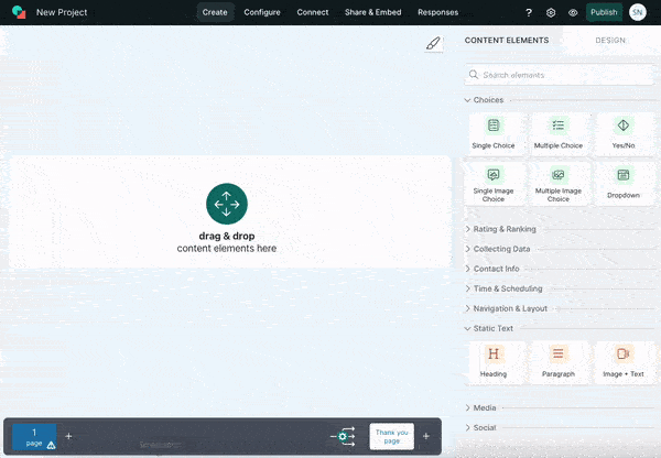
1. No-Code Builder
With involve.me’s drag-and-drop editor, you can create polished event registration landing pages in minutes, no technical skills required. From headlines to CTAs and custom fields, everything is customizable with a simple click.
2. Professionally Designed Templates
Not sure where to start? involve.me offers ready-to-use templates for:
Event registration pages
Webinar sign-up forms
Waitlists for exclusive launches
Speaker application forms
These templates follow event marketing best practices, so you get a conversion-friendly foundation right out of the box.
Create your own events landing pages
Get started with 300+ templates

Event Registration Template

Event Sign-Up Form Template

Event Sign-Up Form For Online Magazines and News Websites Template
3. Personalization With Conditional Logic
Not all attendees are the same. With involve.me, you can use multi-step flows and conditional logic to personalize the journey. For example:
Ask different questions based on whether the registrant is a student, professional, or sponsor.
Show tailored CTAs (like “Request Group Pricing”) depending on responses.
This keeps forms short, engaging, and relevant, leading to higher completion rates.

4. Built-in Email Automation, Plus Integrations.
involve.me automatically sends confirmations, reminders, and follow-ups to every registrant based on their responses, no separate email tool required. It also connects to the tools you already use (HubSpot, Mailchimp, ActiveCampaign, Slack, Zapier, Stripe, and more) when you want to sync data.
Team Collaboration: Slack and Zapier integrations keep your team updated on new sign-ups.
Calendars: Sync directly with Google Calendar so attendees can add events with one click.
Payments: Stripe and PayPal integration make ticketed events frictionless.
5. Built-In Analytics and A/B Testing
Unlike generic form builders, involve.me gives you deep insights into attendee behavior:
Track conversion rates, completion drop-offs, and engagement.
Run A/B tests on headlines, CTAs, or form fields to continuously improve results.
Measure ROI across different traffic sources, ensuring your campaigns deliver.


6. Embeddable or Standalone
Flexibility is key. You can:
Embed your registration form or event page directly into your website.
Publish standalone hosted pages for quick launches or campaigns.
This makes it easy to use involve.me whether you’re running a one-off virtual workshop or managing recurring conferences.

Final Thoughts
The most successful events don’t start at the venue, they start with a focused, action-driven events landing page. By applying best practices, optimizing your event CTA and registration form, and leveraging personalization, you can turn casual visitors into committed attendees.
With involve.me, you don’t need coding skills or design expertise. You can build, test, and optimize beautiful, high-converting pages in minutes.
Build a landing page in minutes
No coding, no hassle, just better conversions.
FAQs
-
Yes, if you’re running segmented campaigns. Personalized landing pages increase conversion rates.
-
Use involve.me's built-in email automation to send personalized sequences to event registrants based on answers, ticket type, or score. The same data also flows into 55+ native integrations (HubSpot, Salesforce, Mailchimp, Klaviyo, Brevo) when you prefer your downstream stack.
-
Yes. involve.me integrates with Stripe and PayPal for ticketed events.
-
Combine urgency tactics (countdowns, limited seats) with social proof and simple forms.
-
Use involve.me’s pre-built templates and drag-and-drop builder. You can launch in under an hour.